DESIGN PHASE
- I ran a card sorting exercise with common features the students would be using in order to figure out how to group the information they would need together and discover if there was an information hierarchy.
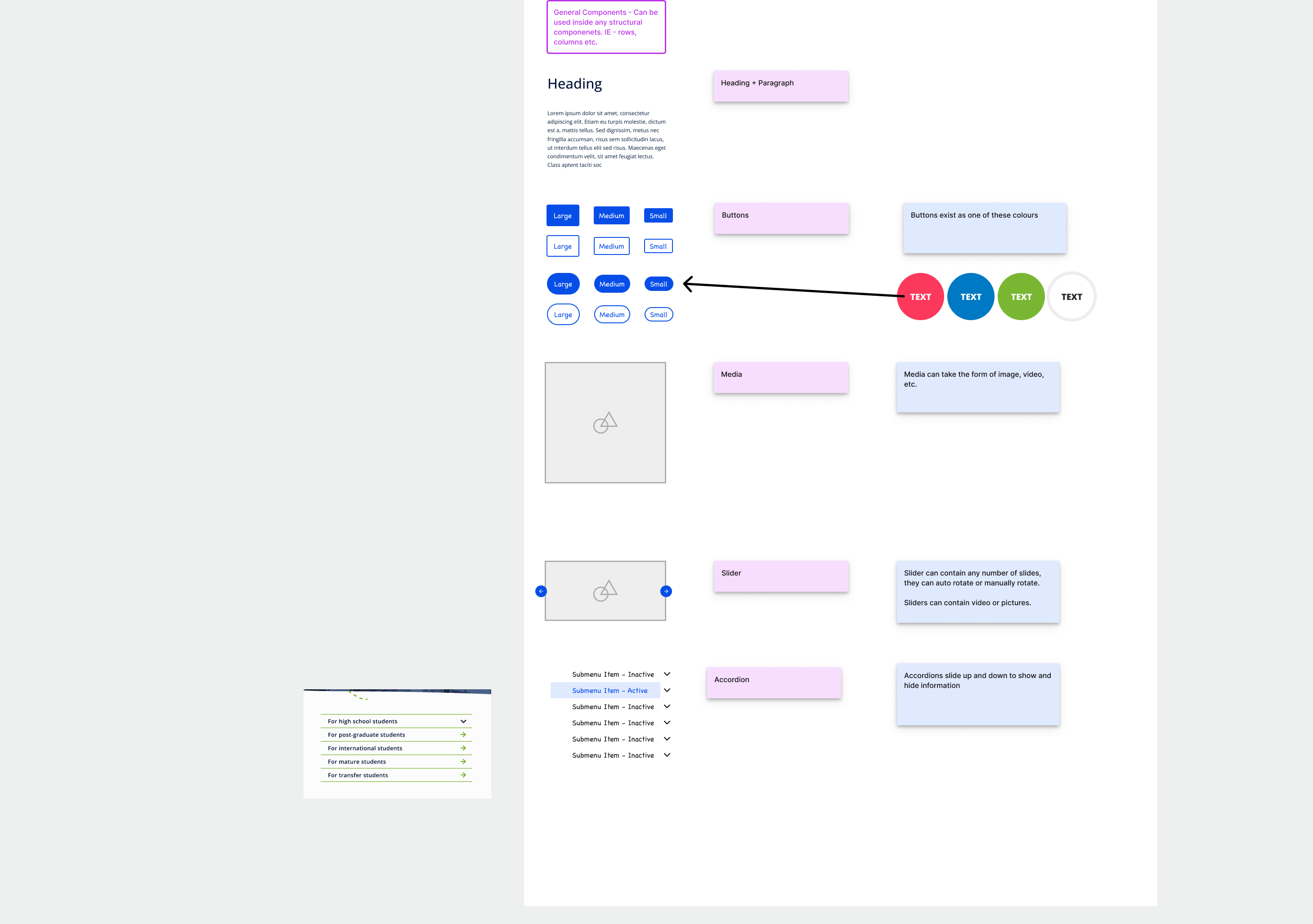
- I then started to standardize the design patterns and components so users can intuitively figure out what a page would do or behave based only on visual cues. This served as the basis for my styling guides, branding guides and components I would reuse in the future in order to minimize developmental work.
- I created a set of low fidelity wireframes in order to show a proof of concept
- I then moved on to make the interactive prototypes, with weekly check ins with my project manager and product owners in order to iterate on the design process.
- I provided input on the language and colour cues given to us by the marketing department. I prefer to keep language and colour consistent in order to confuse the users as little as possible.
DEVELOPMENT PHASE
- During development phases I would review each user story for quality assurance, accessibility and to double check that what worked in Figma works as intended with an actual product.
- As developers encounter technical limitations that made us unable to implement I would redesign it during the cycle.
POST LAUNCH
- I created more system feedback to the user in order to self diagnose issues. We discovered the user issues by emails to our customer service department and interviews with post secondary institutions. For example users were having difficulties finding their applications after submission so I redesigned the navigation in order to highlight this area. Creating more integrated help systems to give the user agency to helps them solve their issues without tech support intervention.
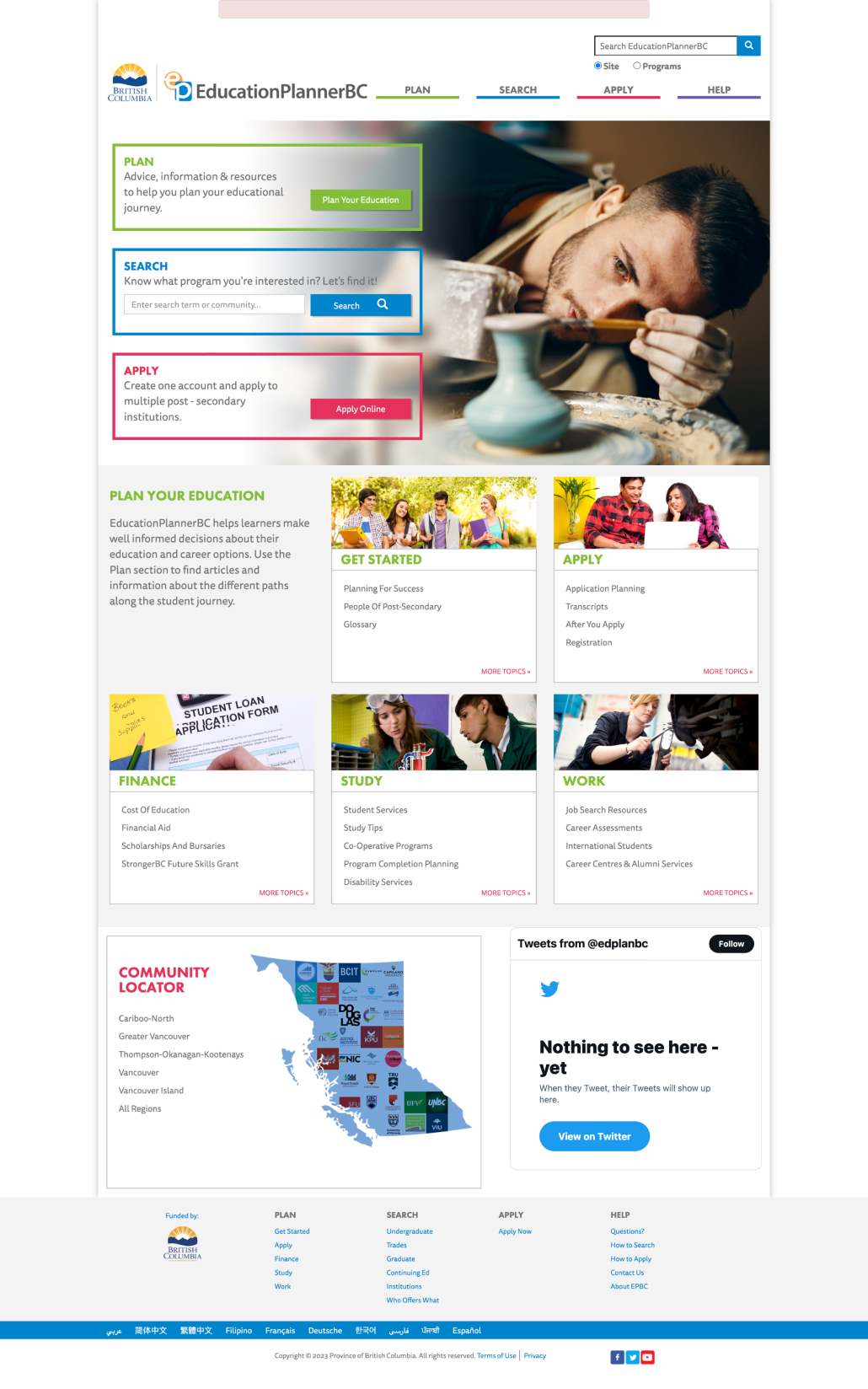
This project allows the marketing department at EduationPlanner BC to create pages without needing the development departments intervention. The data also integrates in from the Management Console Administrative panel I designed, which allows university admins to control the data that is displayed to prospective students. It also allows them to customize their applications questions, fees, campuses available, programs offered and more.